UI/UX Design Principles That Actually Matter
Good design isn't about following trends. It's about understanding users and solving real problems. Let's explore the principles that stand the test of time.
December 20, 2023
Design Isn't Just Making Things Look Pretty
When I started learning about UI / UX design, I thought it was all about aesthetics - choosing the right colors, finding the perfect font, making things look modern and sleek.I was wrong.
Design is about solving problems.It's about making complex things simple. It's about understanding what users need before they even know they need it.The pretty part ? That's just the cherry on top.
User - Centered Design: It's Not About You
Here's a hard truth: Your users don't care how clever your design is.They don't care about that cool animation you spent hours perfecting. They just want to accomplish their goal and move on with their day.
Know Your Users
Before you design anything, ask:
- Who are my users ?
- What are they trying to achieve ?
- What problems are they facing ?
- What's their technical skill level?
Design for them, not for yourself or your portfolio.
Consistency: The Unsung Hero
You know what makes an interface feel professional ? It's not fancy graphics or trendy effects. It's consistency.
- Buttons that look and behave the same way
- Predictable navigation patterns
- Uniform spacing and typography
- Coherent color usage
When users don't have to think about how to use your interface, that's when you've succeeded.
The Power of White Space
Beginners often try to fill every pixel.Don't. White space (or negative space) isn't wasted space - it's a design element.
White space:
- Improves readability
- Draws attention to important elements
- Makes interfaces feel less cluttered
- Gives users' eyes a place to rest
Sometimes the best thing you can add to a design is nothing at all.
Hierarchy: Guide the Eye
Users should never have to hunt for what to do next.Use visual hierarchy to guide them:
Size and Weight
The most important thing should be the biggest and boldest.Headings larger than body text.Primary buttons more prominent than secondary ones.
Color and Contrast
Use color strategically.Your call - to - action button should stand out.Important information should have high contrast.But don't use too many colors - it creates visual noise.
Position and Spacing
Elements closer together are perceived as related.Use spacing to group related items and separate different sections.
Accessibility: Design for Everyone
This isn't optional. Accessible design benefits everyone:
- Color contrast: Text should be readable by everyone, including those with visual impairments
- Font size: Small text isn't trendy - it's excluding users
- Keyboard navigation: Not everyone uses a mouse
- Alt text: Screen readers need descriptions
- Clear labels: Icons alone aren't always clear
Good accessibility is good design, period.
Feedback: Keep Users Informed
Users need to know what's happening. Always.
- Show loading states when data is fetching
- Confirm actions with success messages
- Display error messages that actually help
- Use hover states so users know elements are interactive
- Disable buttons when actions can't be performed
Silence is confusing.Keep users in the loop.
Simplicity: Less Is Often More
Every element in your design should have a purpose.If you can't explain why something is there, remove it.
Ask yourself:
- Does this help users achieve their goal ?
- Can I combine these two features ?
- Is this decoration adding value or just noise ?
- Can I explain this feature in one sentence ?
The best designs are invisible - users accomplish their goals without thinking about the interface.
Mobile First(Or at Least Mobile - Aware)
More people browse on phones than desktops now.Your design needs to work on small screens.
- Touch targets should be big enough(at least 44x44px)
- Important actions should be within thumb reach
- Text should be readable without zooming
- Forms should be easy to fill on mobile
Learn from Others, But Don't Copy
Study great designs.Use design systems like Material Design or Apple's Human Interface Guidelines as learning resources. But understand the 'why' behind design decisions.
Every product is different.Every user group is different.What works for Spotify might not work for your finance app.
Test, Learn, Iterate
The first version won't be perfect. That's okay.Launch it, watch how people use it, and improve.
- Watch users interact with your design
- Ask for feedback(and actually listen to it)
- Track metrics that matter
- Be willing to kill your darlings
Final Thoughts
Good UI / UX design isn't about following trends or using the latest design tool. It's about empathy, clarity, and making people's lives easier.
Start with the basics: consistency, hierarchy, feedback, and accessibility.Get those right, and you're already ahead of most interfaces out there.
Remember: If your users notice your design, it's probably getting in their way. The best design is the one that helps people accomplish their goals without friction.
Now go make something useful!
Here are some other articles you might find interesting.
How My Internship at Coding Jr Kickstarted My Career - From Newbie Errors to Production Code
My complete internship journey at Coding Jr EdTech - working under visionary IIT BHU founders Sumit Bhat & Vikas Shukla, learning production-level coding from incredible mentors, and growing from a nervous intern to a confident developer.
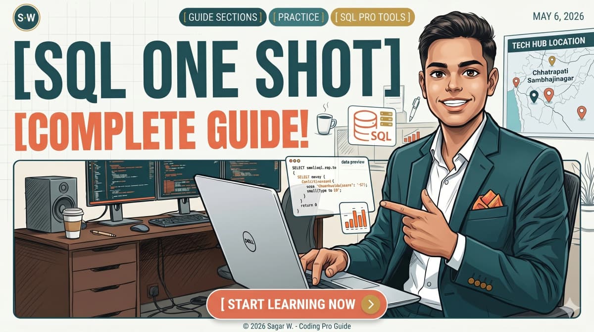
Learn SQL in One Blog - The Only Guide You'll Ever Need
A complete SQL guide covering SELECT, INSERT, UPDATE, DELETE, JOINs, Views, Stored Procedures, Triggers, aggregate functions, GROUP BY, ORDER BY, date functions, transactions, EXPLAIN, and more - with real examples and 23 sections of copy-paste-ready queries.